
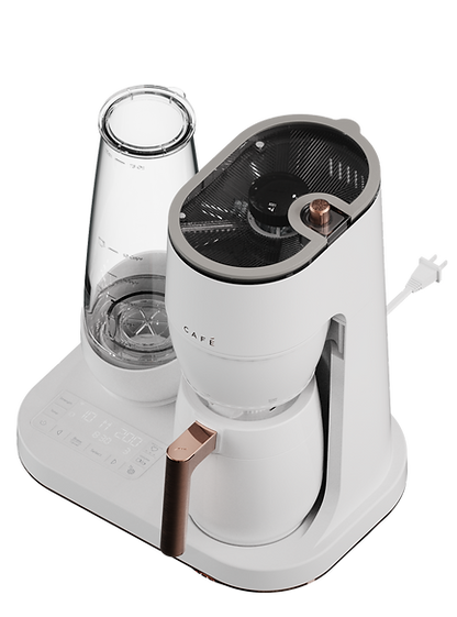
Cafe
Grind and brew


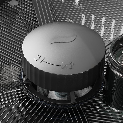
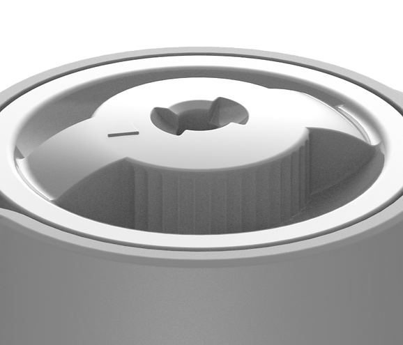
1. Ergonomic Lid
Worked with supplier CAD
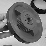
Before
Hard to rotate with wet hands

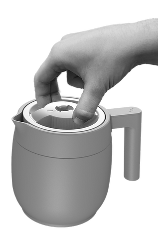
Comfortable and effective
broom
Analyzing existing products of the brand influenced the design decision

Cafe drip coffee - lid
3D print to do
usability testing
After
Improved grip and created consist design elements from previous products
2. Spout improvement
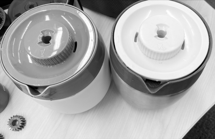
The carafe pouring flow was very slow and didn’t make enough arch.
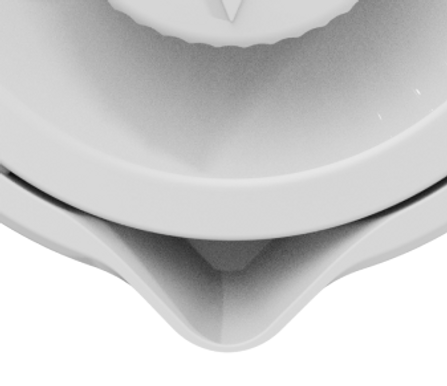
Tip was too rounded and didn't create a nice water flow.
Before
Comfortable and effective
broom

After
Created a pointier tip that allowed for better flow when pouring.


3D printed prototypes to test water flow
Before
After
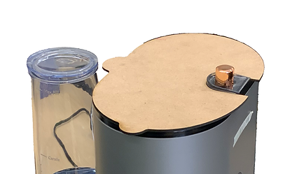
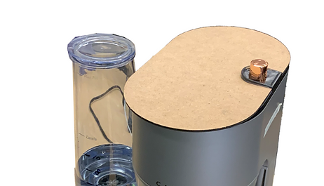
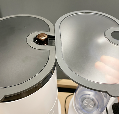
3. Bean hopper lid tab
As a product that is meant to be a counter top product it will live towards a wall and under cabinets which lead us to rethink the access to the bean hopper.
Too close to the wall
Comfortable and effective
broom
A

Iterations
B
C
Final
The size of the tab was reduced and it was moved to the front to improve access.

Comfortable and effective
broom
CMF
What color lid fits all the finishes?


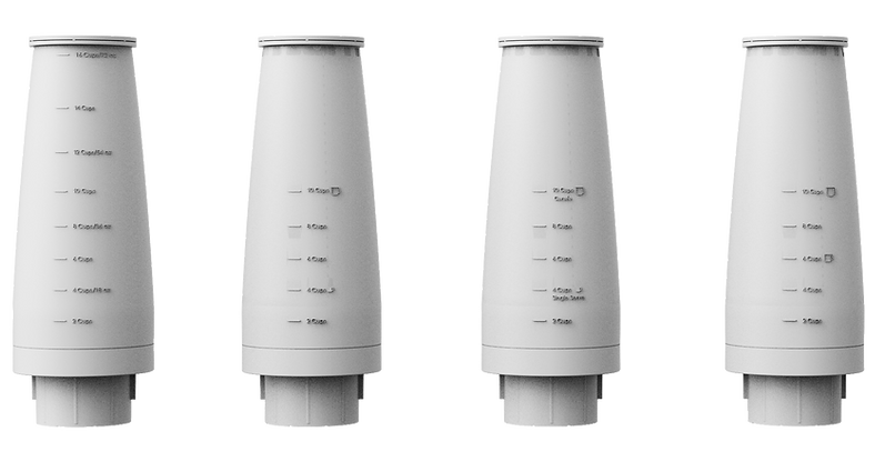
4. Water tank labeling
How might we communicate the amount of water the user might need for their servings?
Comfortable and effective
broom
Final
Iterations

5. Drip tray adjustment
The removable drip tray allows the user to fit higher cups such as travel mugs, we wanted to find the best way to communicate that this part is removable.
How could it be more evident?
Some users didn't know the drip tray could be taken out


What do touch points of the product have in common?
Solution:
Reduce drip tray height to avoid scratching and Add ribbed texture found in other touch points to communicate that this can be taken out


6. UI development - User Testing
1. Has to many buttons
2. disconnection between action (far away from each other)
3. Many steps to brew the coffee

User insights
“It seems like a lot of work to come down and get your coffee when you’re looking at so many other different things”
“Fancy. Thats a little bit sophisticated because I don’t Think an average person would want to go through all of that just to have a cup of coffee when they wake up in the morning”

Competitor Analysis
What are successful UI's doing?
1. Prioritize amount and strength
2. No more than 6 main buttons
3. Streamlined selection (linear motion)
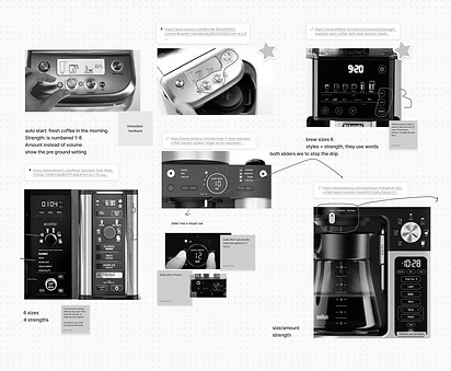
Final UI
1. Prioritize amount and strength
2. No more than 6 main buttons
3. Streamlined selection (linear motion)

7. CMF review with EB2
Second prototype review to check packaging and color in each of the finishes. Feedback was discussed with the supplier.


